From Catalogue Photo to Lifestyle Scene: A Product Reference Workflow
FLB Studio
May 12, 20264 min read
Most lifestyle scene problems with AI image generation come from the reference image, not the prompt. When generated scenes show shifted colours, blurry packaging, or a label that nearly reads the right text but not quite, the culprit is almost always the product photo you uploaded. The prompt sets the scene; the reference sets the product. Upgrading that reference is the single change most likely to take generated output from "obviously AI" to "looks like a planned shoot."
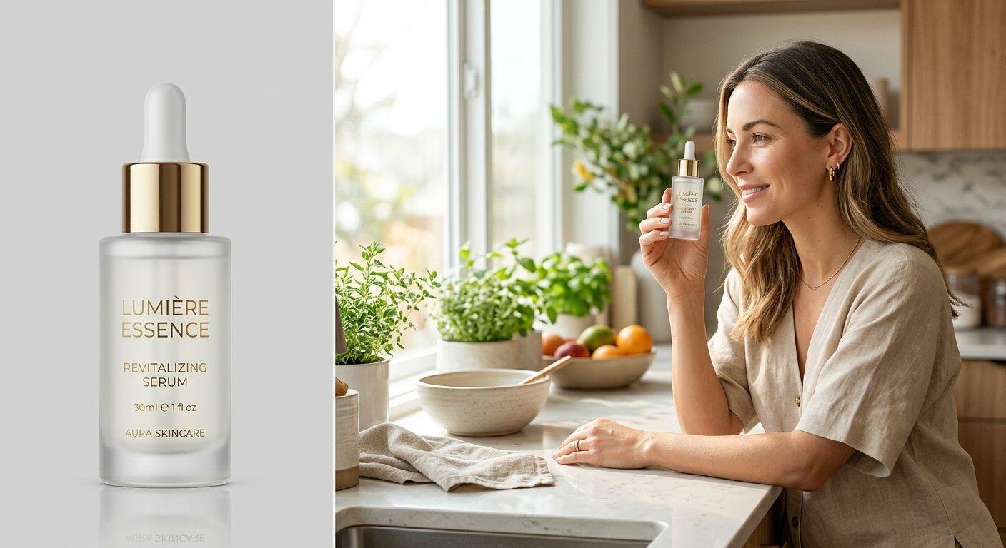
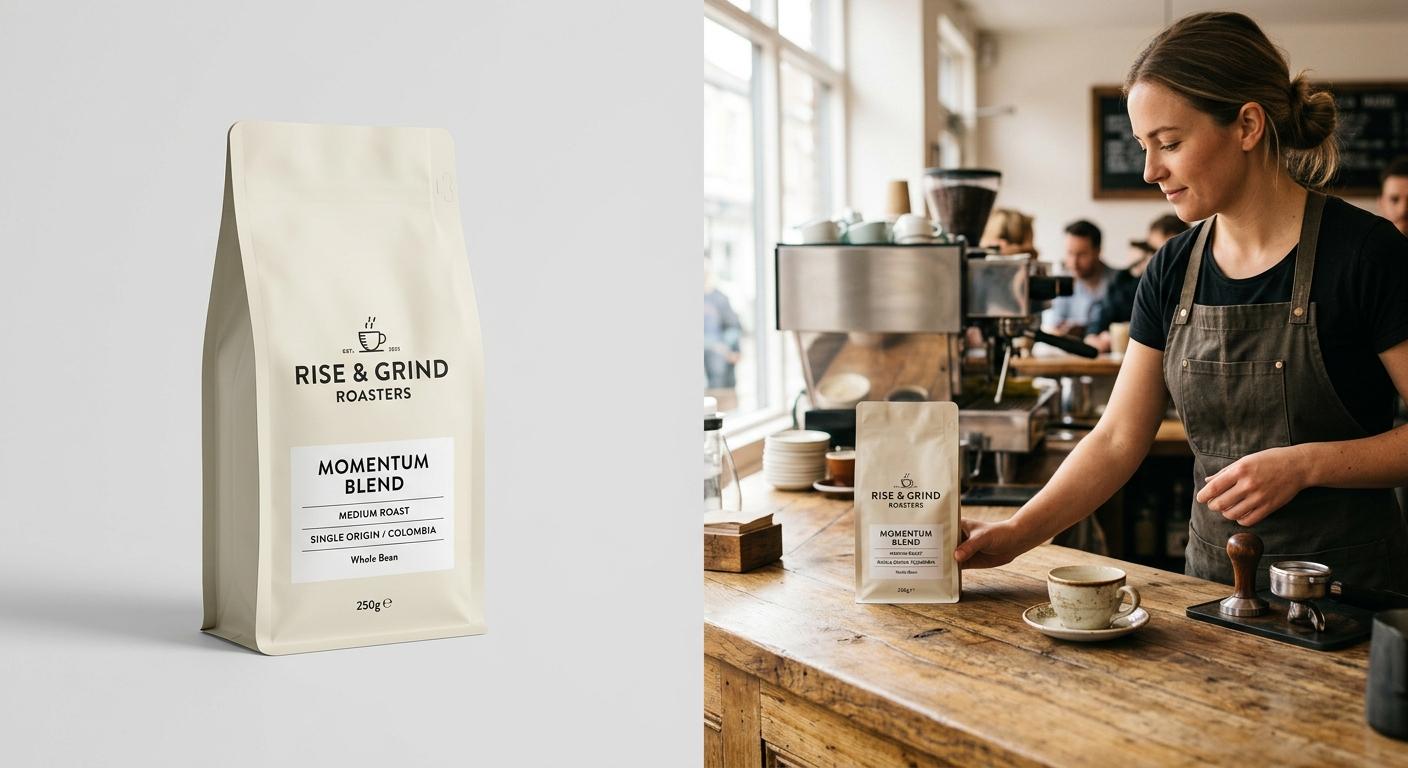
Start with the source file. A clean catalogue photo works fine: 1500 pixels or more on the long edge, even lighting, sharp focus, accurate colours on a calibrated screen, and either a transparent or plain background. Avoid heavy retouching that pushes gloss or saturation past what the product actually looks like in daylight. The model anchors on what it sees, so if the reference shows over-polished plastic, every lifestyle scene will quietly inherit that look. You can see the difference clean references make across our product placement examples, where each case study pairs the source product with the generated result.
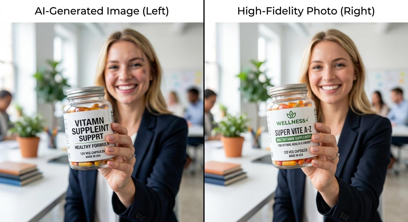
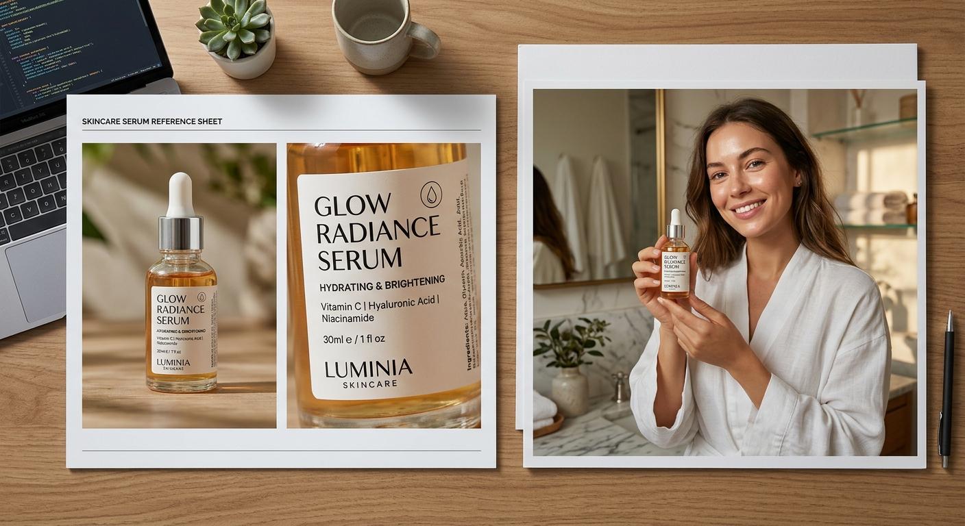
If your packaging carries fine print, a logo placement that has to land exactly, or a multi-panel design, supply a second reference shot. A wider catalogue photo plus a close-up of the label gives the generator two anchors to work from: shape and silhouette from the wide shot, branding accuracy from the close-up. This is the single most reliable fix for hallucinated text. Treat the product photo set as a fixed brand asset, the same way you would treat your logo file. Our AI character marketing glossary defines these reference patterns alongside related terms like persistent character and reference set.
With the reference doing the product work, the prompt becomes a description of the scene only. Where the character is, what they are holding, how the light falls. Resist the urge to describe the product in the prompt at all: every adjective you spend on the bottle, packet, or device is a chance for the model to drift from the reference. Spend the prompt budget on the human and the room instead.
A few failure modes worth flagging. Mirrored logos and reversed text usually come from an asymmetric reference photo: the model interprets it as a stylistic choice. Reshoot or flip the reference rather than fight it in the prompt. Watch for colour drift across a batch, especially in low-saturation packaging: a mid-grey can pull warm under "golden hour" prompts. Keep a reference colour swatch on file and compare every published image back to it. When you are ready to scale this workflow into a full content week, the pricing tiers cover the credit volumes for batched runs.
The pattern is small and load-bearing. One product photo set, prepared once, treated as a fixed asset. One scene prompt per image. The reference does the product work; the prompt does the scene work. Upgrade the reference, and most of the failure modes you have been blaming on prompts will quietly disappear.